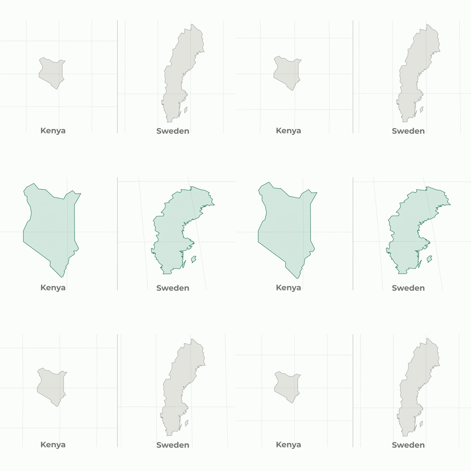
Maps have always been a window into understanding our world, but they can also be deceptive. One of the most common types of maps, the Mercator projection, greatly distorts the relative sizes of countries, particularly those near the poles. This often leads to misconceptions, such as Greenland appearing nearly as large as Africa, when in reality, Africa’s landmass is about 14 times larger.
A fascinating way to challenge these misconceptions is through interactive maps that allow you to guess the relative size of countries and then watch the landmasses morph through different projections, such as from Mercator to the Equal Earth projection. The Equal Earth projection is designed to more accurately reflect the area, providing a better sense of each country’s true size.
For example, many people assume that Canada is larger than China. While Canada does have a huge land area, China’s actual size is slightly bigger when measured accurately. On a Mercator map, Canada’s proximity to the poles inflates its appearance dramatically, but in an Equal Earth projection, China’s size becomes visibly more dominant.
Similarly, Russia, the largest country in the world, often appears enormous on any projection. However, smaller countries near the equator, like those in Africa or South America, tend to be underrepresented in size on Mercator maps. Countries like Brazil, the Democratic Republic of Congo, and Indonesia are significantly larger than they appear.
This distortion matters because it shapes perceptions of global importance, economic power, and even geopolitical influence. An overestimated size can imply greater clout, while underestimated regions might be perceived as less significant.
Interactive map tools that let you guess which country is bigger before revealing the truth via equal-area projections serve as powerful educational aids. They invite users to question what they’ve learned and see the world through a more accurate lens.
By comparing the Mercator and Equal Earth projections side by side, viewers experience a visual transformation that corrects the misperception. Countries near the poles shrink in size to a more realistic scale, while tropical and equatorial nations grow, reflecting their true vastness.
In conclusion, understanding the real sizes of countries on the world map requires awareness of projection distortions. Interactive experiences that enable guessing and reveal accurate area comparisons help cultivate a better geographical intuition. The next time you look at a world map, keep in mind that it might not be telling the full story about the size of nations, and consider exploring the equal-area projections to see just how different the global landscape really is.